IupGauge
Creates a Gauge control. Shows a percent value that can be updated to simulate a progression. It inherits from IupCanvas.
Initialization and Usage
The IupControlsOpen function must be called after
IupOpen. The "iupcontrols.h" file must also be included
in the source code. The program must be linked to the controls library
(iupctrl). In Go it needs the ctrl build tag.
Creation
Ihandle* IupGauge(void);Returns: the identifier of the created element, or NULL if an error occurs.
Attributes
BACKCOLOR (non-inheritable): color of the background inside the borders. Can be NULL. When NULL it follows the parent background color tinted towards FGCOLOR.
CANFOCUS: enables the focus traversal of the control. Default: NO. (different from IupCanvas)
DASHED: Changes the style of the gauge for a dashed pattern. Default is "NO".
FGCOLOR: Controls the gauge and text color. Default: "0 120 220".
FLAT: use a 1 pixel flat border instead of a 3-pixel sunken border. Can be YES or NO. Default: YES.
FLATCOLOR: color of the border when FLAT=YES. Default: "160 160 160".
MAX (non-inheritable): Contains the maximum value. Default is "1".
MIN (non-inheritable): Contains the minimum value. Default is "0".
ORIENTATION (creation-only): can be "VERTICAL" or "HORIZONTAL". Default: "HORIZONTAL". Horizontal goes from left to right, and vertical from bottom to top. Width and height are swapped when orientation is set.
PADDING: internal margin. Works just like the MARGIN attribute of the IupHbox and IupVbox containers, but uses a different name to avoid inheritance problems. Default value: "0x0".
CPADDING: same as PADDING but using the units of the SIZE attribute. It will actually set the PADDING attribute.
SHOWTEXT: Indicates if the text inside the Gauge is to be shown or not. If the gauge is dashed the text is never shown. Possible values: "YES" or "NO". Default: "YES".
SIZE (non-inheritable): The initial size is "120x14". Set to NULL to allow the automatic layout to use smaller values.
TEXT (non-inheritable): Contains a text to be shown inside the Gauge when SHOWTEXT=YES. If it is NULL, the percentage calculated from VALUE will be used. If the gauge is dashed the text is never shown. When ORIENTATION=VERTICAL text is drawn in 90º.
VALUE (non-inheritable): Contains a number between "MIN" and "MAX", controlling the current position.
ACTIVE, BGCOLOR, EXPAND, FONT, SCREENPOSITION, POSITION, MINSIZE, MAXSIZE, WID, TIP, RASTERSIZE, ZORDER, VISIBLE, THEME: also accepted.
Callbacks
MAP_CB, UNMAP_CB, DESTROY_CB: common callbacks are supported.
Notes
To replace a IupProgressBar by a IupGauge, you should set RASTERSIZE=200x30 and SHOWTEXT=NO.
Examples
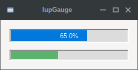
The Two Types of Gauge