IupToggle
Creates the toggle interface element. It is a two-state (on/off) button that, when selected, generates an action that activates a function in the associated application. Its visual representation can contain a text or an image. It can also be displayed as a switch control.
Creation
Ihandle* IupToggle(const char *title);title: Text to be shown on the toggle. It can be NULL. It will set the TITLE attribute.
Returns: the identifier of the created element, or NULL if an error occurs.
Attributes
ALIGNMENT (non-inheritable): horizontal and vertical alignment when IMAGE is defined. Possible values: "ALEFT", "ACENTER" and "ARIGHT", combined to "ATOP", "ACENTER" and "ABOTTOM". Default: "ACENTER:ACENTER". Partial values are also accepted, like "ARIGHT" or ":ATOP", the other value will be obtained from the default value. In Motif, vertical alignment is restricted to "ACENTER". In Windows it is applied only with Visual Styles or when FLAT is set. Text is always left aligned. Not supported in Qt, Cocoa, EFL and Haiku.
BGCOLOR: Background color of toggle mark when displaying a text. The text background is transparent, it will use the background color of the native parent. When displaying an image in Windows, the background is ignored and the system color is used. Default: the global attribute DLGBGCOLOR.
CANFOCUS (creation-only) (non-inheritable): enables the focus traversal of the control. In Windows the control will still get the focus when clicked. Default: YES.
PROPAGATEFOCUS(non-inheritable): enables the focus callback forwarding to the next native parent with FOCUS_CB defined. Default: NO.
FGCOLOR: Color of the text shown on the toggle. In Windows, when using Visual Styles FGCOLOR is ignored, except in dark mode. Default: the global attribute DLGFGCOLOR.
FLAT (creation-only): Hides the toggle borders until the mouse enter the toggle area when the toggle is not checked. If the toggle is checked, then the borders will be shown even if flat is enabled. Used only when IMAGE is defined. Can be YES or NO. Default: NO. On iOS and Android the border is hidden until the toggle is checked, since touch has no hover. Not supported in EFL and Haiku.
IMAGE (non-inheritable): Image name. When the IMAGE attribute is defined, the TITLE is not shown. This makes the toggle looks just like a button with an image, but its behavior remains the same. Use IupSetHandle or IupSetAttributeHandle to associate an image to a name. See also IupImage.
IMPRESS (non-inheritable): Image name of the pressed toggle. Unlike buttons, toggles always display the button border when IMAGE and IMPRESS are both defined.
IMINACTIVE (non-inheritable): Image name of the inactive toggle. If it is not defined but IMAGE is defined then for inactive toggles the colors will be replaced by a modified version of the background color creating the disabled effect.
MARKUP: allows the title string to contain markup
commands. Supports a Pango-like subset: <b>,
<i>, <u>, <s>,
<sub>, <sup>,
<big>, <small>, and
<span> with foreground,
background, font_family,
font_size, font_weight,
font_style attributes. GTK uses Pango markup natively;
other drivers convert to their native format. Works only if a mnemonic
is NOT defined in the title. Can be "YES" or "NO". Default: "NO". Not
supported in Win32, FLTK, Motif and Haiku (markup tags are stripped and
plain text is displayed).
PADDING: internal margin when IMAGE is defined. Works just like the MARGIN attribute of the IupHbox and IupVbox containers, but uses a different name to avoid inheritance problems. Default value: "0x0". Value can be DEFAULTBUTTONPADDING, so the global attribute of this name will be used instead.
RADIO (read-only): returns if the toggle is inside a radio. Can be "YES" or "NO". Valid only after the element is mapped, before returns NULL.
IGNORERADIO (non-inheritable): when set, the toggle will not behave as a radio when inside an IupRadio hierarchy.
RIGHTBUTTON (creation-only): place the check button at the right of the text. Can be "YES" or "NO". Default: "NO". Not supported in Motif, FLTK and EFL.
VALUE (non-inheritable): Toggle's state. Values can be "ON", "OFF" or "TOGGLE". If 3STATE=YES then can also be "NOTDEF". Default: "OFF". The TOGGLE option will invert the current state. In GTK if you change the state of a radio, the unchecked toggle will receive an ACTION callback notification. Can only be set to ON if the toggle is inside a radio, it will automatically set to OFF the previous toggle that was ON in the radio. The first toggle inside an IupRadio will have its value set to ON after map.
TITLE (non-inheritable): Toggle's text. If IMAGE is not defined before map, then the default behavior is to contain a text. The button behavior cannot be changed after map. The natural size will be larger enough to include all the text in the selected font, even using multiple lines, plus the button borders or check box if any. The '\n' character is accepted for line change. The "&" character can be used to define a mnemonic, the next character will be used as a key. Use "&&" to show the "&" character instead on defining a mnemonic. The toggle can be activated from any control in the dialog using the "Alt+key" combination.
SWITCH (creation-only): displays the toggle as a switch control instead of a checkbox. Can be "YES" or "NO". Default: "NO". Ignored when the toggle is inside an IupRadio. The switch does not draw TITLE, it is the switch's accessible name unless ACCESSIBLETITLE is set.
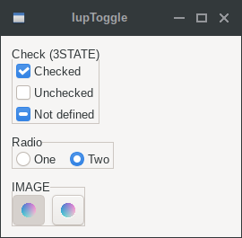
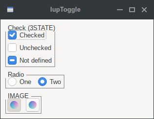
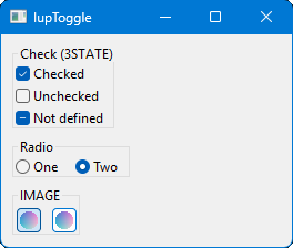
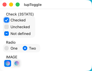
3STATE (creation-only): Enable a three state toggle. Valid for toggles with text only, and that do not belong to a radio. Can be "YES" or "NO". Default: "NO". Not supported in FLTK and EFL.
ACTIVE, FONT, EXPAND, SCREENPOSITION, POSITION, MINSIZE, MAXSIZE, WID, TIP, SIZE, RASTERSIZE, ZORDER, VISIBLE, THEME: also accepted.
Callbacks
ACTION: Action generated when the toggle's state (on/off) was changed. The callback also receives the toggle's state.
int function(Ihandle* ih, int state);ih: identifier of the element that activated the
event.
state: 1 if the toggle's state was shifted to on; 0 if
it was shifted to off. For a 3-state toggle, -1 when shifted to
NOTDEF.
Returns: IUP_CLOSE will be processed.
VALUECHANGED_CB: Called after the value was interactively changed by the user. Called after the ACTION callback but under the same context.
int function(Ihandle *ih);ih: identifier of the element that activated the event.
MAP_CB, UNMAP_CB, DESTROY_CB, GETFOCUS_CB, KILLFOCUS_CB, ENTERWINDOW_CB, LEAVEWINDOW_CB, K_ANY, HELP_CB: All common callbacks are supported.
Notes
Toggle with image or text cannot change its behavior after mapped. This is a creation attribute. But after creation, the image can be changed for another image, and the text for another text.
Toggles are activated using the Space key.
To build a set of mutual exclusive toggles, insert them in an IupRadio container. They must be inserted before creation, and their behavior cannot be changed. If you need to dynamically remove toggles that belong to a radio in Windows, then put the radio inside an IupFrame that has a title.
A toggle that is a child of an IupRadio automatically receives a name when it is mapped into the native system.
Examples
| GTK | Qt | Win32 | macOS |
 |
 |
 |
 |