IupButton
Creates an interface element that is a button. When selected, this element activates a function in the application. Its visual presentation can contain a text and/or an image.
Creation
Ihandle* IupButton(const char *title);title: Text to be shown to the user. It can be NULL. It will set the TITLE attribute.
Returns: the identifier of the created element, or NULL if an error occurs.
Attributes
ALIGNMENT (non-inheritable): horizontal and vertical alignment. Possible values: "ALEFT", "ACENTER" and "ARIGHT", combined to "ATOP", "ACENTER" and "ABOTTOM". Default: "ACENTER:ACENTER". Partial values are also accepted, like "ARIGHT" or ":ATOP", the other value will be obtained from the default value. In Motif, vertical alignment is restricted to "ACENTER". In GTK, horizontal alignment for multiple lines will align only the text block.
BGCOLOR: Background color. If text and image are not defined, the button is configured to simply show a color, in this case set the button size because the natural size will be very small. In Windows and in GTK 3, the BGCOLOR attribute is ignored if text or image is defined. Default: the global attribute DLGBGCOLOR. BGCOLOR is ignored when FLAT=YES because it will be used the background from the native parent.
CANFOCUS (creation-only) (non-inheritable): enables the focus traversal of the control. In Windows the button will respect CANFOCUS differently to some other controls. Default: YES.
PROPAGATEFOCUS(non-inheritable): enables the focus callback forwarding to the next native parent with FOCUS_CB defined. Default: NO.
FLAT (creation-only): Hides the button borders until the mouse cursor enters the button area. The border space is always there. Can be YES or NO. Default: NO. On Android and iOS the button has no background; on Android an image-only flat button keeps the 48dp touch target.
FGCOLOR: Text color. Default: the global attribute DLGFGCOLOR.
IMAGE (non-inheritable): Image name. If set before map defines the behavior of the button to contain an image. The natural size will be size of the image in pixels, plus the button borders. Use IupSetHandle or IupSetAttributeHandle to associate an image to a name. See also IupImage. If TITLE is also defined and not empty both will be shown.
IMINACTIVE (non-inheritable): Image name of the element when inactive. If it is not defined then the IMAGE is used and the colors will be replaced by a modified version of the background color creating the disabled effect. GTK will also change the inactive image to look like other inactive objects.
IMPRESS (non-inheritable): Image name of the pressed button. If IMPRESS and IMAGE are defined, the button borders are not shown and not computed in natural size. When the button is clicked the pressed image does not offset. In Motif the button will lose its focus feedback also.
IMPRESSBORDER (non-inheritable): if enabled, the button borders will be shown and computed even if IMPRESS is defined. Can be "YES" or "NO". Default: "NO".
IMAGEPOSITION (creation-only) (non-inheritable): Position of the image relative to the text when both are displayed. Can be: LEFT, RIGHT, TOP, BOTTOM. Default: LEFT. Not supported in Motif and EFL. On Android BOTTOM is displayed as TOP.
MARKUP: allows the title string to contain markup
commands. Supports a Pango-like subset: <b>,
<i>, <u>, <s>,
<sub>, <sup>,
<big>, <small>, and
<span> with foreground,
background, font_family,
font_size, font_weight,
font_style attributes. Works only if a mnemonic is NOT
defined in the title. Can be "YES" or "NO". Default: "NO". Not supported
in Win32, FLTK and Motif (markup tags are stripped and plain text is
displayed).
PADDING: internal margin. Works just like the MARGIN attribute of the IupHbox and IupVbox containers, but uses a different name to avoid inheritance problems. Default value: "0x0". Value can be DEFAULTBUTTONPADDING, so the global attribute of this name will be used instead.
CPADDING: same as PADDING but using the units of the SIZE attribute. It will actually set the PADDING attribute.
SPACING (creation-only): defines the spacing between the image associated and the button's text. Default: "2".
CSPACING: same as SPACING but using the units of the vertical part of the SIZE attribute. It will actually set the SPACING attribute.
SHOWASDEFAULT (non-inheritable): draws the button with the platform's native "default button" emphasis. Can be "YES" or "NO". Default: "NO". Normally set automatically when the button is assigned to the parent dialog's DEFAULTENTER attribute, no manual action required. Can also be set directly for visual-only emphasis without wiring to DEFAULTENTER. Not supported in EFL (the attribute is accepted but has no visual effect).
BUTTONSTYLE [Android and iOS Only] (non-inheritable): button visual style. Values: "FILLED" (default), "TONAL", "OUTLINED", "ELEVATED", "TEXT". When set, takes precedence over FLAT and SHOWASDEFAULT.
CORNERSTYLE [Android and iOS Only] (non-inheritable): button corner shape. Values: "SMALL", "MEDIUM", "LARGE", "CAPSULE". When unset, the platform's stock default is used. Independent of BUTTONSTYLE.
TITLE (non-inheritable): Button's text. If IMAGE is not defined before map, then the default behavior is to contain only a text. The button behavior cannot be changed after map. The natural size will be larger enough to include all the text in the selected font, even using multiple lines, plus the button borders. The '\n' character is accepted for line change. The "&" character can be used to define a mnemonic, the next character will be used as key. Use "&&" to show the "&" character instead on defining a mnemonic. The button can be activated from any control in the dialog using the "Alt+key" combination.
ACTIVE, FONT, EXPAND, SCREENPOSITION, POSITION, MINSIZE, MAXSIZE, WID, TIP, SIZE, RASTERSIZE, ZORDER, VISIBLE, THEME: also accepted.
Callbacks
ACTION: Action generated when the button 1 (usually left) is selected. This callback is called only after the mouse is released and when it is released inside the button area.
int function(Ihandle* ih);ih: identifier of the element that activated the event.
Returns: IUP_CLOSE will be processed.
BUTTON_CB: Action generated when any mouse button is pressed and when it is released. Both calls occur before the ACTION callback when button 1 is being used.
MAP_CB, UNMAP_CB, DESTROY_CB, GETFOCUS_CB, KILLFOCUS_CB, ENTERWINDOW_CB, LEAVEWINDOW_CB, K_ANY, HELP_CB: All common callbacks are supported.
Notes
Buttons with images and/or texts cannot change its behavior after mapped. This is a creation dependency. But after creation, the image can be changed for another image, and the text for another text.
Buttons are activated using Enter or Space keys.
Buttons are not activated if the user clicks inside the button but moves the cursor and releases outside the button area. Also in Windows, the highlight feedback when that happens is different if the button has CANFOCUS enabled or not.
Buttons always have borders, except when IMAGE and IMPRESS are both defined and IMPRESSBORDER=NO. In this case in Windows TITLE can also be defined.
Usually toolbar buttons have FLAT=YES and CANFOCUS=NO.
Examples
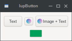
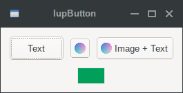
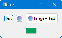
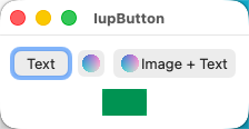
The buttons with image and text simultaneous have PADDING=5x5, the other buttons have no padding. The buttons with no text and BGCOLOR defined have their RASTERSIZE set.
| GTK | Qt | Win32 | macOS |
 |
 |
 |
 |